ST558 Project 2 - NASA APIs
Shyam Gadhwala & Kamlesh Pandey
- Introduction and required libraries
- Asteroid - NeoWs
- Coronal Mass Ejection (CME) Analysis
- Parent Wrapper Function
- Exploratory Data Analysis for Asteroid - NeoWs API Data
- Exploratory Data Analysis (EDA) of Coronal Mass Ejection (CME) Analysis API Data.
- Ending Remarks
Introduction and required libraries
This vignette is based on demonstrating how to interact with the NASA APIs. Two of the NASA’s APIs have been used for this project, namely Asteroid-NeoWs API and Coronal Mass Ejection Analysis API. The primary purpose of the functions used in this vignette is to call an end point of the API, download data from the API and explore visualization package ggplot2 for exploratory data analysis of the fetched data to gain valuable insights.
Few of the essential packages used for this project are:
httr to provide a wrapper function and
customized to the demand of modern web APIs.
jsonlite
to provide flexibility in mapping json and R data
lubridate to manipulate date and
time
ggplot2 used for creating graphics
tidyverse for data analysis purpose
library(httr)
library(tidyverse)
library(jsonlite)
library(dplyr)
library(ggplot2)
library(ggpubr)
library(jpeg)
library(lubridate)
library(GGally)
library(corrplot)
Asteroid - NeoWs
NeoWs (Near Earth object Web Service) is a REST API for near earth Asteroid information. Near Earth Objects (NEOs) are comets and asteroids and due to the gravitational attraction of nearby planet they enter into earth gravitational orbit
Asteroid - NeoWs API
This API has near earth objects (NEO) tracking and the data set has 99% asteroids and only 1% comet data.
This API offers the following modifications:
- Magnitude (H): Asteroid absolute magnitude is the visual magnitude a observer would record if asteroid is place 1AU away from the sun
- Close-Approach (CA) Date : Date (TBD) of closest Earth approach.
- V Relative : Object velocity relative to the earth
- Maximum_Diameter (miles): Estimated maximum diameter in miles
- Minimum_Diameter (miles): Estimated minimum diameter in miles
Helper function to get the Asteroid NeoWs data:
This function will call the API with desired modification. This API has
start and end date as modifications. User can provide a date range for
the API and by GET request we can retrieve the data. The start and end
date are mandatory input without any default argument.
This helper function has multiple checks for correct format for start
and end date. In case of correct input dates, the modification will be
added to the API and respective data is generated.
The data columns extracted from the APIs are as follow: 1. Magnitude
- Minimum Diameter(miles)
- Maximum Diameter(miles)
- Relative Velocity
- Approach Date
- Miss Distance (AU)
- Orbiting Body 2. IS Asteroid Potentially hazardous
asteroidData <- function(start_date, end_date, ...){
  baseURL <- 'https://api.nasa.gov/neo/rest/v1/'
  apiKey <- 'igUogzKaubKUi5TTgsbYcdVgU8pICrvizcCrCtY5'
  endpoint <- 'feed'
  url <- paste0(baseURL, endpoint, '?startDate=', start_date, '&endDate=', end_date,'&api_key=', apiKey)

  # GET request for API
  res <- GET(url)
  asteroidData <- fromJSON(rawToChar(res$content))

  # check for  correct date format
  dateFormat <- "%Y-%m-%d"

  # check if start and end dates are in correct format or not
  checkStart <- tryCatch(!is.na(as.Date(start_date, dateFormat)),
             error = function(err)
             {TRUE})
  checkEnd <- tryCatch(!is.na(as.Date(end_date, dateFormat)),
             error = function(err)
             {TRUE})

  # if eother the start or the end dates are not in correct format stop the program
  if (checkStart == FALSE | checkEnd == FALSE){
    message <- paste('[ERROR..!!] Either your start or end date is not is correct YYYY-MM-DD format')
    stop(message)
  }
  # if both start and end dates are in correct format
  else if(checkStart == TRUE & checkEnd == TRUE){

    # check if end_date > start_date, if true stop the program
    if (ymd(end_date) < ymd(start_date)){
      message <- paste('End date' , end_date, 'should be greater than the start date', start_date)
      stop(message)

      }
    # if dates are in correct format then execute the code
    else if (ymd(end_date) > ymd(start_date)){

        # check for the diff between the start and end date
        diffDate <- difftime(ymd(end_date), ymd(start_date), units = 'days')

        if (diffDate > 8){
          message <- paste('[WARNING..!!] The difference between the date range should be less than 8 days',
                           'for this current date range the API will return future Approach date ')
        }

        # API Parameters
        magnitude <- c()
        dMin  <- c()
        dMax <- c()
        velocity <- c()
        Date <- c()
        missDist <- c()
        orbitBody <- c()
        isHazard <- c()

        for (i in 1:length(asteroidData$near_earth_objects)) {
          absMag <- asteroidData$near_earth_objects[[i]]$absolute_magnitude_h
          dMin_  <- asteroidData$near_earth_objects[[i]]$estimated_diameter$miles$estimated_diameter_min
          dMax_ <- asteroidData$near_earth_objects[[i]]$estimated_diameter$miles$estimated_diameter_max
          isHazard_ <- asteroidData$near_earth_objects[[i]]$is_potentially_hazardous_asteroid

          tempDate <- c()
          tempVel <- c()
          tempDist <- c()
          tempOrbit <- c()

          # for close approach
          for (j in 1:length(asteroidData$near_earth_objects[[i]]$close_approach_data)){
            # approach velocity from the API
            vel <- asteroidData$near_earth_objects[[i]]$close_approach_data[[j]]$relative_velocity$kilometers_per_hour
            # storing in a temporary factor
            tempVel <- append(tempVel, vel)
            # getting date from the API
            date <- asteroidData$near_earth_objects[[i]]$close_approach_data[[j]]$close_approach_date
            # storing in a temporary factor
            tempDate <- append(tempDate, date)
            # miss distance from the API
            dist <- asteroidData$near_earth_objects[[i]]$close_approach_data[[j]]$miss_distance$astronomical
            # storing in a temporary factor
            tempDist <- append(tempDist, dist)
            # getting orbiting body from the API
            orbit <- asteroidData$near_earth_objects[[i]]$close_approach_data[[j]]$orbiting_body
            # storing in a temporary factor
            tempOrbit <- append(tempOrbit, orbit)
          }
          missDist <- append(missDist, as.numeric(tempDist))
          Date <- append(Date, tempDate)
          velocity <-append(velocity, as.numeric(tempVel))
          magnitude <- append(magnitude, absMag)
          dMin <- append(dMin, dMin_)
          dMax <- append(dMax, dMax_)
          orbitBody <- append(orbitBody, tempOrbit)
          isHazard <- append(isHazard, isHazard_)

  }
      }
  }
  #final tibble
  aesData <- tibble('Magnitude' = magnitude,
                    'Minimum_Diameter' = dMin,
                    'Maximum_Diameter' = dMax,
                    'Relative_Velocity' = velocity,
                    'Approach_Date' = Date,
                    'Miss_Distance' = missDist,
                    'Orbiting_Body' = orbitBody,
                    'Is_Potentially_Hazardous_Asteroid' = isHazard)

# This function will return the URL of the API and the data set generated
return (list(url = url, data = aesData))
}
Coronal Mass Ejection (CME) Analysis
The sun of our solar system has multiple atmospheric layers. The inner layers are the Core, Radiative Zone and Convection Zone. The outer layers are the Photo sphere, the Chromosphere, the Transition Region and the Corona. Coronal Mass Ejection (CME) phenomena is when there are huge explosions of plasma and field from the sun’s corona layer. These explosions typically have certain path and speed when they are emitted in the heliosphere. Sometimes intense CMEs travel at speeds more than 3000 km/s. The radiation or the solar wind takes up to 17-18hours to reach earth. Hence, to predict severe solar radiation, we need to see the characteristics of the explosions, and find any correlations between its properties.
Coronal Mass Ejection (CME) Analysis API:
This api is a part of Space Weather Database of Notifications, Knowledge, Information (DONKI) online tool for space weather related APIs and data. As a part of DONKI, the following api has been released by NASA that helps with the data of such CME events:
Some of the modifications offered in this API are:
- Start Date: Desired starting date from which the data wants to be collected (default value is 30 days prior to current UTC time)
- End Date: Desired ending date till when the data wants to be collected (default value is current UTC time
- Most Accurate Only (default set to True)
- Complete Entry Only (default set to True)
- Speed (lower limit): Speed of the coronal mass ejection event (default set to 0)
- Half Angle (lower limit): the angle of the coronal mass ejection event with respect to vertical axis (default set to 0)
- Catalog (default set to ALL)
- Keyword (default set to NONE)
In this vignette, we have focused on the main 4 modifications,
- Start Date
- End Date
- Speed (in km/s)
- Half Angle (in degrees)
Helper function to get the CME data:
This is a helper function that will call the API endpoint according to the modification values. This function takes the above mentioned 4 modifications as input; the start date, the end date, minimum speed, and minimum half angle.
The start date and end date are mandatory for any user to enter, while speed and half angle both have a default value of 0, so if the values for speed or half angle are not specified, it will take 0 as the input.
To make the API function more rigid, I have implemented many checks that includes the start and end date format check, speed and half angle values and data type check, and throw warnings and errors accordingly. If the input data is correct then the modification values are appended to the base URL of the API, which is called and a JSON is returned as a result which will have the details of the CME event between the two dates having mentioned speed and half angle characteristics.
The data from the JSON extracted here are:
- time: Time of the CME event
- latitude: The latitude value of the coordinate where the CME event took place
- longitude: The longitude value of the coordinate where the CME event took place
- halfAngle: The half angle value of the trajectory of the explosion (in degrees)
- speed: The speed of the explosion (in km/s)
- type: Type of events (classifications include “C”, “O”, “R”, “S”)
A tibble is created with the above stated details and is returned from the function along with the URL that was formed from the input values for modifications.
cmeData <- function(startDate, endDate, speed = 0, halfAngle = 0, ...){
  baseUrl <- 'https://api.nasa.gov/DONKI/'
  apiKey <- 'igUogzKaubKUi5TTgsbYcdVgU8pICrvizcCrCtY5'

  # Start and End Dates data format check
  checkStart <- !is.na(parse_date_time(startDate, orders = "ymd"))
  if(!checkStart){
    errorMessage <- "Please enter the Start Date in the YYYY-mm-dd format and try again."
    stop(errorMessage)
  }

  checkEnd <- !is.na(parse_date_time(endDate, orders = "ymd"))
  if(!checkEnd){
    errorMessage <- "Please enter the End Date in the YYYY-mm-dd format and try again."
    stop(errorMessage)
  }

  if (as.Date(startDate) > as.Date(endDate)){
    errorMessage <- "The start date cannot be after the end date. Please enter the dates again."
    stop(errorMessage)
  }

  #Speed and Half Angle data type checks
  if (!is.numeric(speed)){
    errorMessage <- "Speed can only take numeric values. Please enter speed again."
    stop(errorMessage)
  }

  if (!is.numeric(halfAngle)){
    errorMessage <- "Half Angle can only take numeric values. Please enter half angle again."
    stop(errorMessage)
  }

  if (speed < 0){
    warning("Warning: ", "The speed cannot be negative. Proceeding with its default value of 0.")
    speed = 0
  }

  if (halfAngle < 0){
    warning("Warning: ", "The half angle cannot be negative. Proceeding with its default value of 0.")
    halfAngle = 0
  }

  #this part of the code combines the base URL with the modification(s) value(s) entered by the user
  #targetUrl is the final URL that is hit to get the data from API
  targetUrl <- paste0(baseUrl, "CMEAnalysis?", "startDate=", startDate,
                      "&endDate=", endDate, "&speed=", speed,
                      "&halfAngle=", halfAngle, "&api_key=", apiKey)

  jsonContent <- fromJSON(rawToChar(GET(targetUrl)$content))

  #extracting useful info from the API data
  time <- jsonContent$time21_5
  lat <- jsonContent$latitude
  lon <- jsonContent$longitude
  halfAngle_ <- jsonContent$halfAngle
  speed_ <- jsonContent$speed
  type <- jsonContent$type

  cmeDataTibble <- tibble(time = time, latitude = lat, longitude = lon, halfAngle = halfAngle_,speed = speed_, type = type)


  return(list(url = targetUrl, data = cmeDataTibble))
}
Parent Wrapper Function
The following the is the main parent wrapper function. This function takes the following input:
- api: The API that the user is interested in calling (Coronal Mass Ejection (CME) Analysis or Asteroids - NeoWs)
For this, the user can either give the abbreviated or the full name of the api, either will lead to the same call of the designated API.
- …: This takes the additional input for particular APIs. For Coronal Mass Ejection (CME) Analysis API, it will read the start date, end date, speed and half angle. For Asteroids - NeoWs, it will read the start date and end date.
Note: If any API other than the above mentioned two is called, an error message will be thrown stating that this API is not yet supported.
apiSelection <- function(api, ...){

  if (tolower(api) == tolower("Coronal Mass Ejection (CME) Analysis") |
      tolower(api) == tolower("cme")){
    return(cmeData(...))

  }
  else if(tolower(api) == tolower("Asteroids - NeoWs")){
    return(asteroidData(...))

  }
  else{
    return("This api is not yet supported. Please select from either 'Coronal Mass Ejection (CME) Analysis' or 'Asteroid (AST)'.")
  }
}
Exploratory Data Analysis for Asteroid - NeoWs API Data
Calling the API for Asteroid-NEOs from the wrapper function using sample start and end date. Here I have selected start date as 2017-01-01, and the end date as 2017-08-01.
When the API returns the data, the useful data is converted to a tibble and is showed below. I have also called the summary function to get an overview of numerical feature columns.
# first API call
astDf <- apiSelection(api = "Asteroids - NeoWs", '2019-01-10', '2019-08-10')$data

# second API call
astDf1 <- apiSelection(api = "Asteroids - NeoWs", '2017-01-01', '2017-08-01')$data

# Merging results from both API call
astDf <- rbind(astDf, astDf1)

knitr::kable(summary(astDf %>% select(Magnitude:Miss_Distance, -Approach_Date)))
| Magnitude | Minimum_Diameter | Maximum_Diameter | Relative_Velocity | Miss_Distance | |
|---|---|---|---|---|---|
| Min. :16.76 | Min. :0.001896 | Min. :0.00424 | Min. : 7037 | Min. :0.003582 | |
| 1st Qu.:20.62 | 1st Qu.:0.019429 | 1st Qu.:0.04344 | 1st Qu.: 35301 | 1st Qu.:0.186202 | |
| Median :22.15 | Median :0.061379 | Median :0.13725 | Median : 49976 | Median :0.291632 | |
| Mean :22.65 | Mean :0.103730 | Mean :0.23195 | Mean : 52996 | Mean :0.283531 | |
| 3rd Qu.:24.65 | 3rd Qu.:0.123998 | 3rd Qu.:0.27727 | 3rd Qu.: 67034 | 3rd Qu.:0.386678 | |
| Max. :29.70 | Max. :0.734355 | Max. :1.64207 | Max. :123714 | Max. :0.498633 |
# EDA on Asteroid data

plot1 <- ggplot(astDf, aes(x = Approach_Date, y = Miss_Distance))

plot1 + geom_point(aes(color = Is_Potentially_Hazardous_Asteroid, size = Maximum_Diameter), alpha = 0.7) +
  theme(axis.text.x = element_text(angle = 45), axis.text.y = element_blank())+
  theme(axis.text.y = element_blank(),
        axis.ticks.y = element_blank()) +
  labs(title = 'Point Plot',
      subtitle = "Miss Distance For Date Range")
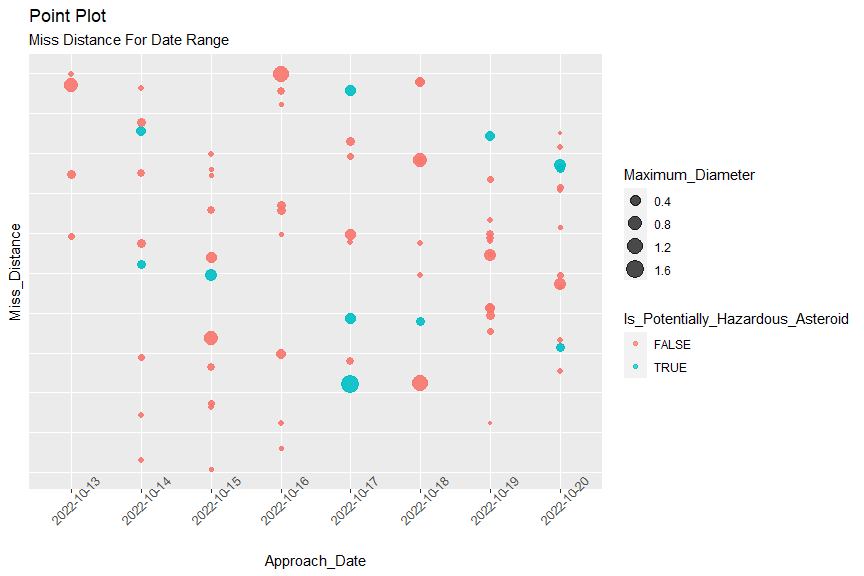 In the
scatter plot, I have tried to visualize the count for Miss Distance for
a give n date range with diameter as a size and if that particular
asteroid is hazardous or not. Few key finding from the plots:
In the
scatter plot, I have tried to visualize the count for Miss Distance for
a give n date range with diameter as a size and if that particular
asteroid is hazardous or not. Few key finding from the plots:
- Most of the asteroids are categorized as a non hazardous for a given date range
- All bigger asteroid (large diameter) are in upper part of the plot
# boxplot for min and max diamter

par(mfrow = c(1,2))
plot2 <- ggplot(astDf, aes(x = Is_Potentially_Hazardous_Asteroid,  y = Minimum_Diameter))

plot2 +
  geom_boxplot() + geom_point(aes(color = Is_Potentially_Hazardous_Asteroid), position = 'jitter') +
  labs('Box Plot for Minimum Diameter') +
  xlab('If Asteroid Hazardous ') +
  ylab('Minimum Diamter') +
  labs(title = "Box Plot",
       subtitle = "Minimum Diamter Variation Across Asteroid Type ")
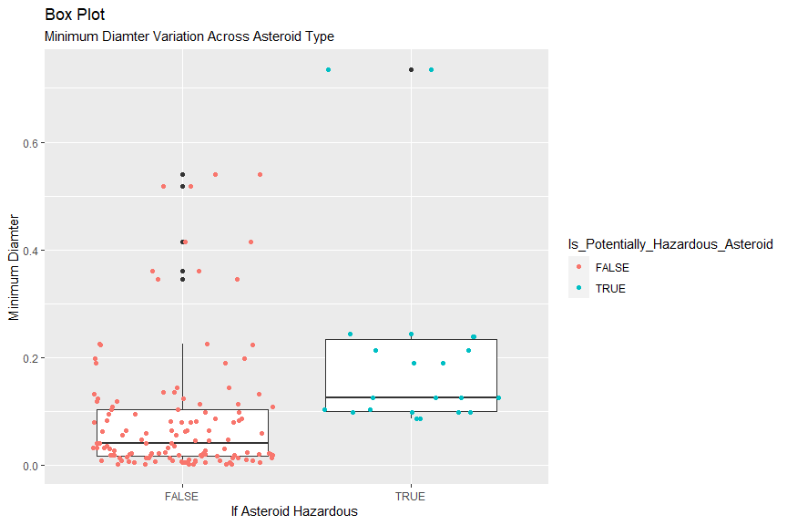
The dark line in box plot represent the median and the top box is 75 %ile and bottom box is 25 %ile. The end points of the black line are whiskers and they are at a distance of 1.5*IQR. In this plot we can visualize that the median diameter of potentially hazardous asteroid is higher than the non hazardous asteroid. From the plot, we can also visualize few extreme points (>1.5IQR).
numericalDf <- astDf[, c(1,2,3,4,6)]

corr <- cor(numericalDf, method = "spearman")

# Plot
corrplot(corr, hc.order = TRUE,
           type = "lower",
           tl.pos = "lt",
         title = "Correlation Plot",
         subtitle = "Correlation Coefficient for Asteroid Data",
         mar=c(0,0,2,0)
         )
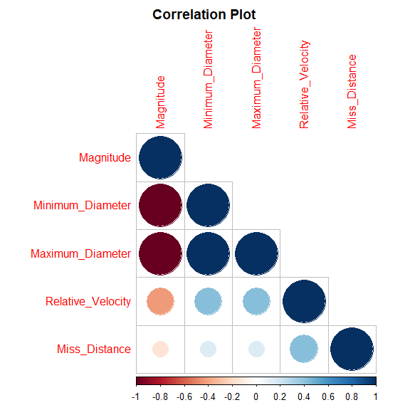
Correlation plot gives the relation among parameters, i.e is there any increase or decrease in a parameter directly affecting other parameter. From this correlation plot of asteroid data we can estimate that almost all parameters have a weak positive correlation coefficient.Magnitude and Relative velocity has a strong negative correlation coefficient, which needs to be taken care (adding interaction terms) in a model building.
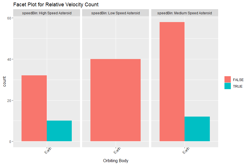
# creating a new factor for relative speed
speedClassfication <- c("Low Speed Asteroid", "Medium Speed Asteroid", "High Speed Asteroid" )
astDf <- astDf %>%
  mutate(speedBin = factor(if_else(Relative_Velocity<37000, speedClassfication[1],
                                   if_else(Relative_Velocity<66000, speedClassfication[2],
                           speedClassfication[3]))))
# plot
plot3 <- ggplot(astDf, aes(x = Orbiting_Body, fill = Is_Potentially_Hazardous_Asteroid))

plot3 + geom_bar(stat = 'count', position = position_dodge()) +
        facet_grid(cols = vars(speedBin),
                   labeller = label_both) +                          #
                    theme(axis.text.x = element_text(angle = 45),
                          legend.title = element_blank()) +
        xlab('Orbiting Body') +
        labs(title = "Facet Plot for Relative Velocity Count ")
Exploratory Data Analysis (EDA) of Coronal Mass Ejection (CME) Analysis API Data.
Here, I am calling the API for CME from the wrapper function using some sample start and end date twice. For the first call, I have selected start date as 2015-01-01, and the end date as 2016-06-30, and for the second call I have selected the start date as 2017-01-01 and end date as 2019-12-31. The speed and half angle are kept as default that is 0.
When the API returns the data, the useful data is converted to a tibble and is showed below. Both tibbles are merged into a single tibble that will be used further here in the project. I have printed the summary of the data to get a generalized overview.
# First API call
cmeSampleData <- apiSelection("Coronal Mass Ejection (CME) Analysis", "2015-01-01", "2016-06-30")$data
# Second API call
cmeSampleData2 <- apiSelection("Coronal Mass Ejection (CME) Analysis", "2017-01-01", "2019-12-31")$data

# Merging data from both API
cmeSampleData <- rbind(cmeSampleData, cmeSampleData2)

print(cmeSampleData)
## # A tibble: 942 × 6
## time latit…¹ longi…² halfA…³ speed type
## <chr> <dbl> <dbl> <dbl> <dbl> <chr>
## 1 2015-01-01… 31 26 32 350 S
## 2 2015-01-02… 3 34 23 353 S
## 3 2015-01-03… -49 -82 42 210 S
## 4 2015-01-07… 9 39 12 532 C
## 5 2015-01-08… 67 -102 20 579 C
## 6 2015-01-09… -10 2 13 265 S
## 7 2015-01-10… -19 31 16 510 C
## 8 2015-01-10… 7 -90 15 260 S
## 9 2015-01-11… 59 -100 30 200 S
## 10 2015-01-12… 72 -90 15 250 S
## # … with 932 more rows, and abbreviated variable
## # names ¹latitude, ²longitude, ³halfAngle
knitr::kable(summary(cmeSampleData %>% select(halfAngle, speed, latitude, longitude)))
| halfAngle | speed | latitude | longitude | |
|---|---|---|---|---|
| Min. : 2.00 | Min. : 88.0 | Min. :-83.000 | Min. :-180.000 | |
| 1st Qu.:18.00 | 1st Qu.: 289.2 | 1st Qu.:-14.000 | 1st Qu.: -90.000 | |
| Median :25.00 | Median : 386.0 | Median : 2.000 | Median : -1.500 | |
| Mean :26.09 | Mean : 454.0 | Mean : 4.259 | Mean : -1.001 | |
| 3rd Qu.:33.00 | 3rd Qu.: 550.0 | 3rd Qu.: 20.000 | 3rd Qu.: 90.000 | |
| Max. :75.00 | Max. :2650.0 | Max. : 90.000 | Max. : 178.000 |
From summary we can see some statistics of our variables from tibble.
To start with the initial EDA, using ggplot2 library, I have made a scatter plot representing the latitude and longitude of each of the CME events taking place on sun’s atmosphere. The different colored dots represent the different event types, while the size of the dots represent the speed of explosion; the smaller the dot, the lesser the speed of the event and vice versa.
img <- readJPEG("img\\sun2.jpeg")

cmeSampleData$type <- as.factor(cmeSampleData$type)

show(ggplot(cmeSampleData, aes(x=latitude, y=longitude)) +
    geom_point(aes(color = type, size = speed)) +
    ylim(-180,180) +
    xlim(-90, 90)  +
  labs(title="Plot showing Corona Mass Ejection on Sun's corona",
        x ="Latitude", y = "Longitude"))
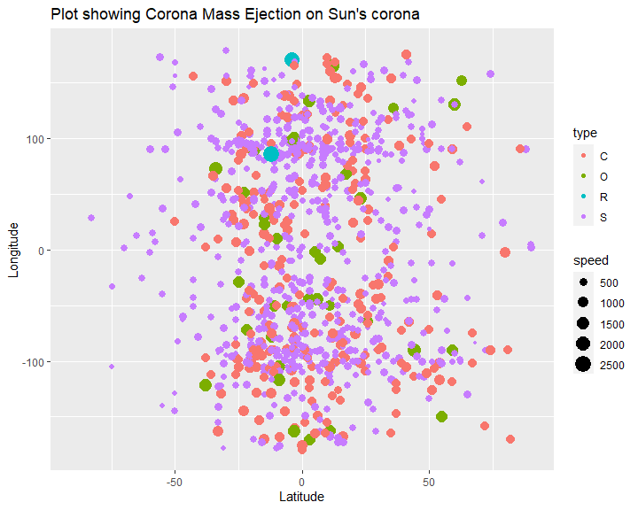
From the graph, we can see that the CME events are scattered throughout the sun’s surface depicted by latitude and longitude values. Majority of the CME events are of type “S” and “C”, while type “R” seem to be the least in number.
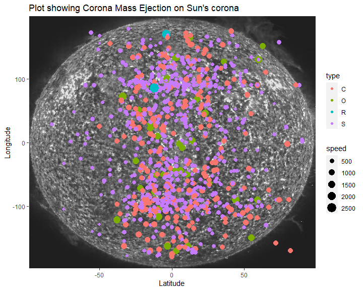
To see it more in respect to the actual sun’s corona layer, I have imported an image of sun and use it as a background to give a better perspective of where the events took place. (the sun’s corona layer to CME events is not to scale, and is only for representational purposes).
ggplot(cmeSampleData, aes(x=latitude, y=longitude)) +
    background_image(img) +
    geom_point(aes(color = type, size = speed)) +
    ylim(-180,180) +
    xlim(-90, 90)  +
  labs(title="Plot showing Corona Mass Ejection on Sun's corona",
        x ="Latitude", y = "Longitude")
To gain more insights about the data, I have segregated the speed, location, and half angle from the data.
- The speed has 4 classifications; Slow Paced, Medium Paced, Fast Paced and Hyper Paced.
- Location is divided into 4 zones based on their latitude and longitude; North-East, North-West, South-East and South-West.
- Half Angles are classified into 3 categories; low, medium and high
After adding these classified variables, I am again printing the data.
cmeSampleData$type <- as.factor(cmeSampleData$type)

speedClassfication <- c("Slow Paced", "Medium Paced", "Fast Paced", "Hyper Paced")

cmeSampleData <- cmeSampleData %>%
  mutate(speedC = as.factor(if_else(speed < 500, speedClassfication[1],
                                            if_else(speed < 1000,  speedClassfication[2],
                                                    if_else(speed < 2000, speedClassfication[3], speedClassfication[4])))))


zones <- c("North-East", "North-West", "South-East", "South-West")
cmeSampleData <- cmeSampleData %>%
  mutate(zone = as.factor(if_else(latitude>=0 & longitude>=0, zones[1],
                        if_else(latitude<=0 & longitude>=0,zones[2],
                                if_else(latitude<=0 & longitude<=0, zones[4],
                                        if_else(latitude>=0 & longitude<=0, zones[3], "Error"))))))

angles <- c("low", "medium", "high")
cmeSampleData <- cmeSampleData %>%
  mutate(halfAngleC = as.factor(if_else(halfAngle <= 25, angles[1],
                                            if_else(halfAngle <= 45,  angles[2],
                                                     angles[3]))))

cmeSampleData
## # A tibble: 942 × 9
## time latit…¹ longi…² halfA…³ speed type
## <chr> <dbl> <dbl> <dbl> <dbl> <fct>
## 1 2015-01-01… 31 26 32 350 S
## 2 2015-01-02… 3 34 23 353 S
## 3 2015-01-03… -49 -82 42 210 S
## 4 2015-01-07… 9 39 12 532 C
## 5 2015-01-08… 67 -102 20 579 C
## 6 2015-01-09… -10 2 13 265 S
## 7 2015-01-10… -19 31 16 510 C
## 8 2015-01-10… 7 -90 15 260 S
## 9 2015-01-11… 59 -100 30 200 S
## 10 2015-01-12… 72 -90 15 250 S
## # … with 932 more rows, 3 more variables:
## # speedC <fct>, zone <fct>, halfAngleC <fct>,
## # and abbreviated variable names ¹latitude,
## # ²longitude, ³halfAngle
Then from the data, I have grouped the data by combining zone, speed and type of event, and for each group, I have calculated the number of events, average Speed, Standard deviation of speed, average half angle and standard deviation of half angle.
cmeSampleData %>%
  group_by(zone, speedC, type) %>%
  summarize(avgSpeed = mean(speed), sdSpeed = sd(speed),
            avgHalfAngle = mean(halfAngle),
            sdHalfAngle = sd(halfAngle), count = n()) %>% arrange(zone, speedC)
## # A tibble: 13 × 8
## # Groups: zone, speedC [13]
## zone speedC type avgSp…¹ sdSpeed avgHa…²
## <fct> <fct> <fct> <dbl> <dbl> <dbl>
## 1 North-East Fast … O 1256 202. 39.4
## 2 North-East Mediu… C 630. 104. 24.6
## 3 North-East Slow … S 320. 95.3 25.1
## 4 North-West Fast … O 1298. 258. 40.6
## 5 North-West Hyper… R 2460. 268. 50
## 6 North-West Mediu… C 666. 129. 32.8
## 7 North-West Slow … S 336. 101. 24.1
## 8 South-East Fast … O 1259. 241. 37.3
## 9 South-East Mediu… C 648. 131. 30.5
## 10 South-East Slow … S 320. 89.1 23.5
## 11 South-West Fast … O 1300. 151. 40
## 12 South-West Mediu… C 668. 132. 27.8
## 13 South-West Slow … S 326. 92.5 24.1
## # … with 2 more variables: sdHalfAngle <dbl>,
## # count <int>, and abbreviated variable names
## # ¹avgSpeed, ²avgHalfAngle
Then contingency table is created for zone, speed and type of events, and is showed below.
print(table(cmeSampleData$zone, cmeSampleData$speedC, cmeSampleData$type))
## , ,  = C
##
##
##              Fast Paced Hyper Paced Medium Paced
##   North-East          0           0           60
##   North-West          0           0           53
##   South-East          0           0           72
##   South-West          0           0           65
##
##              Slow Paced
##   North-East          0
##   North-West          0
##   South-East          0
##   South-West          0
##
## , ,  = O
##
##
##              Fast Paced Hyper Paced Medium Paced
##   North-East          8           0            0
##   North-West          8           0            0
##   South-East         12           0            0
##   South-West          9           0            0
##
##              Slow Paced
##   North-East          0
##   North-West          0
##   South-East          0
##   South-West          0
##
## , ,  = R
##
##
##              Fast Paced Hyper Paced Medium Paced
##   North-East          0           0            0
##   North-West          0           2            0
##   South-East          0           0            0
##   South-West          0           0            0
##
##              Slow Paced
##   North-East          0
##   North-West          0
##   South-East          0
##   South-West          0
##
## , ,  = S
##
##
##              Fast Paced Hyper Paced Medium Paced
##   North-East          0           0            0
##   North-West          0           0            0
##   South-East          0           0            0
##   South-West          0           0            0
##
##              Slow Paced
##   North-East        181
##   North-West        157
##   South-East        161
##   South-West        154
From the above contingency table, some statistics to observe are that for “C” type events, all of the explosions are medium paced, for “O” type, all explosions are fast paced, for “R” type, all explosions are hyper paced and for “S” type, all events are slow paced. This might suggest some correlation between speed of explosion and type of event.
A simpler contingency table between the count of CME events per zone per speed category is as shown:
knitr::kable(table(cmeSampleData$zone, cmeSampleData$speedC))
| Fast Paced | Hyper Paced | Medium Paced | Slow Paced | |
|---|---|---|---|---|
| North-East | 8 | 0 | 60 | 181 |
| North-West | 8 | 2 | 53 | 157 |
| South-East | 12 | 0 | 72 | 161 |
| South-West | 9 | 0 | 65 | 154 |
To further see the statistics about the CME events in each zone, I have
plotted the following:
The 4 different colors represent 4 different zones, the shape of each
event represents the type of the event, and the size of each events
represents the speed of ejection during the CME event (Sun’s surface to
event locations is not to scale and is only for representation
purposes).
ggplot(cmeSampleData, aes(x=latitude, y=longitude)) +
    background_image(img) +
    geom_point(aes(color = zone, size = speedC, shape = type)) +
    scale_size_discrete(name = "speed", labels = c(speedClassfication[1], speedClassfication[2], speedClassfication[3], speedClassfication[4])) +
    ylim(-180,180) +
    xlim(-90, 90) +

    annotate(geom="text", x=70, y=150, label=paste0("North-East Region\ncount : ", nrow(cmeSampleData %>% filter(zone==zones[1])), "\navgSpeed : ", round(mean((cmeSampleData %>% filter(zone == zones[1]))$speed), 2),
                                                  "\navgHalfAngle : ", round(mean((cmeSampleData %>% filter(zone == zones[1]))$halfAngle), 2)),
              color="White", size=4) +

  annotate(geom="text", x=-70, y=150, label=paste0("North-West Region\ncount : ", nrow(cmeSampleData %>% filter(zone==zones[2])), "\navgSpeed : ", round(mean((cmeSampleData %>% filter(zone == zones[2]))$speed), 2),
                                                  "\navgHalfAngle : ", round(mean((cmeSampleData %>% filter(zone == zones[2]))$halfAngle), 2)),
              color="White", size=4) +

  annotate(geom="text", x=-70, y=-150, label=paste0("South-West Region\ncount : ", nrow(cmeSampleData %>% filter(zone==zones[4])), "\navgSpeed : ", round(mean((cmeSampleData %>% filter(zone == zones[4]))$speed), 2),
                                                  "\navgHalfAngle : ", round(mean((cmeSampleData %>% filter(zone == zones[4]))$halfAngle), 2)),
              color="White", size=4) +

  annotate(geom="text", x=70, y=-150, label=paste0("South-East Region\ncount : ", nrow(cmeSampleData %>% filter(zone==zones[3])), "\navgSpeed : ", round(mean((cmeSampleData %>% filter(zone == zones[3]))$speed), 2),
                                                  "\navgHalfAngle : ", round(mean((cmeSampleData %>% filter(zone == zones[3]))$halfAngle), 2)),
              color="White", size=4) +
  labs(title="Plot showing zone-wise Corona Mass Ejection statistics",
        x ="Latitude", y = "Longitude")
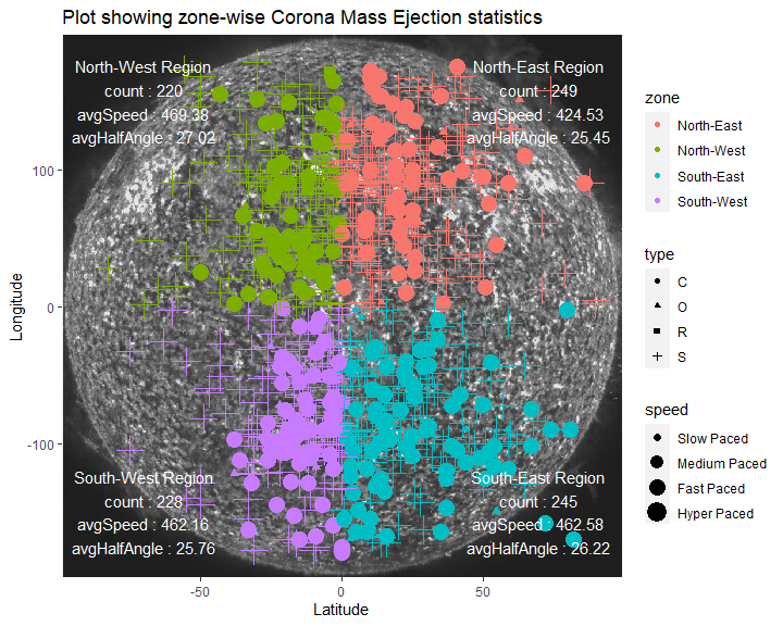
From the plot above, we can see the statistics of each zone. It seems that most CME events took place in the North-East region (249 events), with an average speed of 424.53 km/s, and with an average half angle of 25.45 degrees. The least CME events occurred in North-West region (220 events), with an average speed of 469.38 km/s and with average half angle of 27.02 degrees.
Here this suggests that as the average half angle increase, average speed also increases. To check that,a scatter plot between speed and half angle is also shown to visualize correlation between the two variables. A linear model regression line is also fitted with the help of geom_smooth function.
cor <- cor(cmeSampleData$halfAngle, cmeSampleData$speed)

ggplot(cmeSampleData, aes(x=halfAngle, y=speed)) +
  geom_point(aes(color = type)) +
  geom_smooth(method = "lm",color="black") +
  labs(title="Scatter Plot showing relation between speed and half angle of the CME event",
        x ="Half Angle", y = "Speed") +
  annotate(geom="text", x=20, y=2000, label=paste0("Correlation between \nSpeed and \nHalf angle = ", round(cor, 3)))
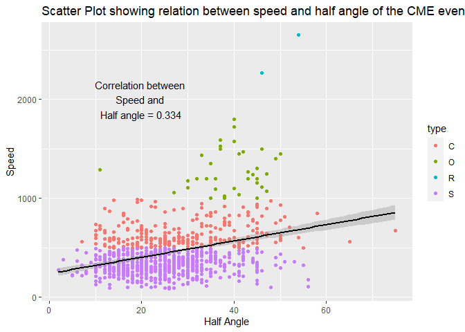
The initial speculations were true since the speed and half angle do show a positive correlation between them.
Then for each zone, I have plotted a “dodge” type bar plot representing count of CME events that are classified by their half angle values.
ggplot(cmeSampleData, aes(x = type)) +
  geom_bar(aes(fill = halfAngleC), position = "dodge") +
  scale_fill_discrete(name = "Half Angle") +
  facet_grid(. ~ zone) +
  labs(title="Bar plot showing count of CME events in each zone \nclassified into each type and half angle of the events ",
        x ="Type", y = "Count of CME events")
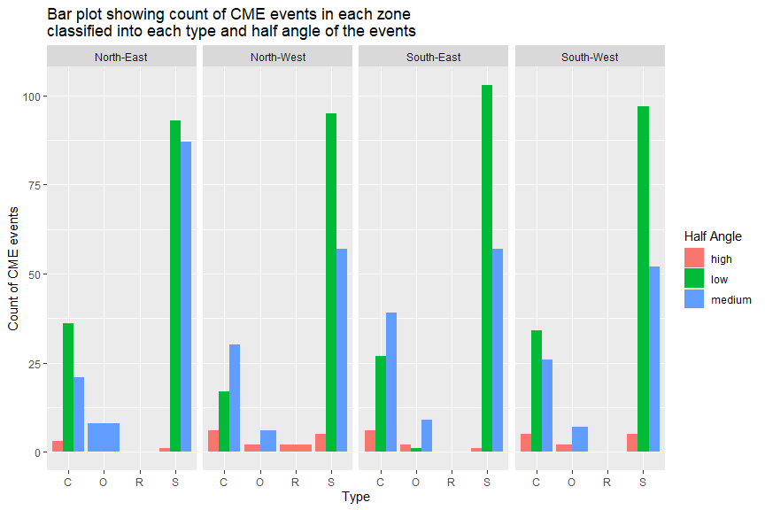
From the plot it seems that in most of the regions, the CME events occurred with a low half angle. In some of the zones, some types of events did not take place, for example; no type “R” events took place in North-East zone. Such insights are useful when making predictions or developing machine learning models.
Lastly, I took the dates (time-stamp) of events, and extracted months and years from them, and plotted histograms for the count of CME events occurring in each month, and each year between the given input start and end dates, classified into the type of events on the histograms bins.
dates = c()
for (i in 1:nrow(cmeSampleData)){
  dates <- append(dates, strsplit(cmeSampleData$time[i], split="T")[[1]][1])
}
cmeSampleData$date <- dates

months = c()
for (i in 1:nrow(cmeSampleData)){
  months <- append(months, strsplit(cmeSampleData$date[i], split="-")[[1]][2])
}

years = c()
for (i in 1:nrow(cmeSampleData)){
  years <- append(years, strsplit(cmeSampleData$date[i], split="-")[[1]][1])
}

cmeSampleData$numyear <- as.numeric(years)
cmeSampleData$numyear <- as.factor(cmeSampleData$numyear)

cmeSampleData$nummonth <- as.numeric(months)
allmonths <- c("Jan","Feb","Mar",
              "Apr","May","Jun",
              "Jul","Aug","Sep",
              "Oct","Nov","Dec")
cmeSampleData$month <- allmonths[cmeSampleData$nummonth]
cmeSampleData$month <- as.factor(cmeSampleData$month)

cmeSampleData$month <- factor(cmeSampleData$month, ordered = TRUE, levels = c("Jan","Feb","Mar",
              "Apr","May","Jun",
              "Jul","Aug","Sep",
              "Oct","Nov","Dec"))

ggplot(cmeSampleData %>% group_by(month) %>% mutate(count = n()), aes(x=month))+
  geom_histogram(aes(fill=type), stat="count") +
  scale_fill_discrete(name = "Type") +
  labs(title="Histogram showing count of CME events in month \nthat occurred between the given dates.",
        x ="Month", y = "Count of CME events")
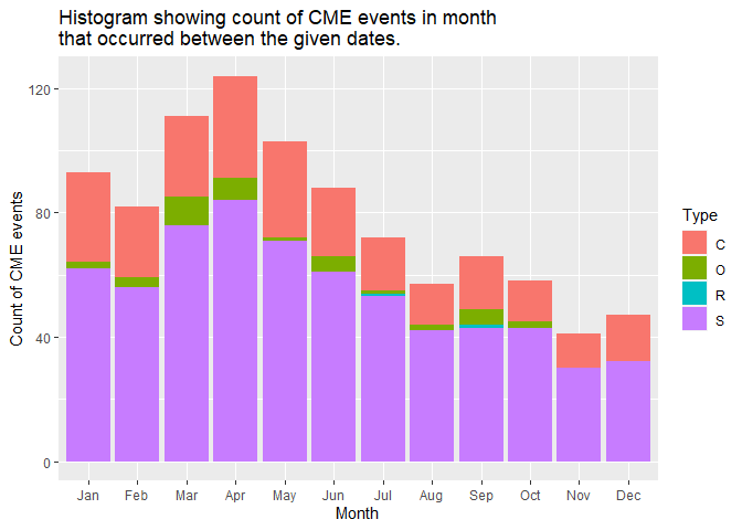
The above plot suggests that CME events peaked in April every year, and then decreased till December, and again on a rise till April. This also might lead to the fact that Earth experiences most heat in months from April to July.
ggplot(cmeSampleData %>% group_by(numyear) %>% mutate(count = n()), aes(x=numyear))+
  geom_histogram(aes(fill=type), stat="count") +
  scale_fill_discrete(name = "Type") +
  labs(title="Histogram showing count of CME events in each year \nthat occurred between the given dates.",
        x ="Year", y = "Count of CME events")
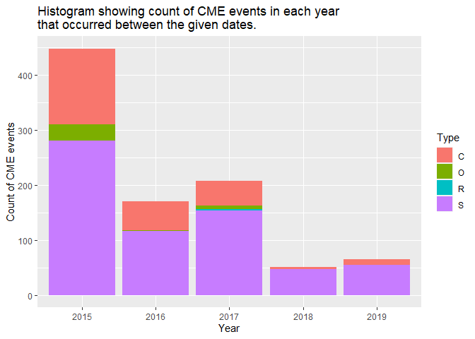
The plot above shows that most CME events took place in the year of 2015 (~450), while least CME events took place in the year of 2018 (~50). We can use this information to see if it correlates to the average temperature that Earth experienced in these years and see if we can find any pattern between CME events and temperature on earth.
Ending Remarks
To summarize this vignette, we have built a wrapper function that would take the API of user’s choice as input. Further two helper functions are also created to support the called API. Coronal Mass Ejection (CME) Analysis helps get the data of coronal mass ejection events between two date ranges, and will have characteristics of the speed and half angle as defined by the user. In similar fashion asteroid API helps in retrieving data pertaining to near earth objects like asteroid and comets. Following up on the date retrieved after the API call, we have done the Exploratory Data Analysis to get some hidden and valuable insights from the data.
Hope the functions build for this vignette helps for the NASA APIs!